Uranus Bottles
A visual identity built around a simple, playful symbol.
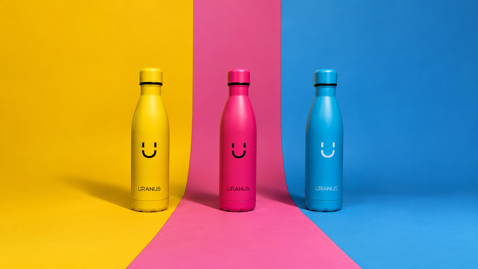
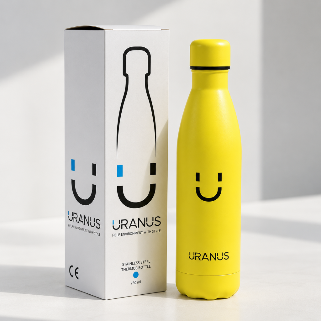
The project focused on creating a clear and flexible identity that could work across a colourful product range and different applications. The visual system included the logotype, monogram, packaging and digital communication.
CLIENT
Uranus
SERVICES
Brand Identity, Packaging, Print & Digital Design
CREDITS
Ornella Gianforte
YEAR
2020


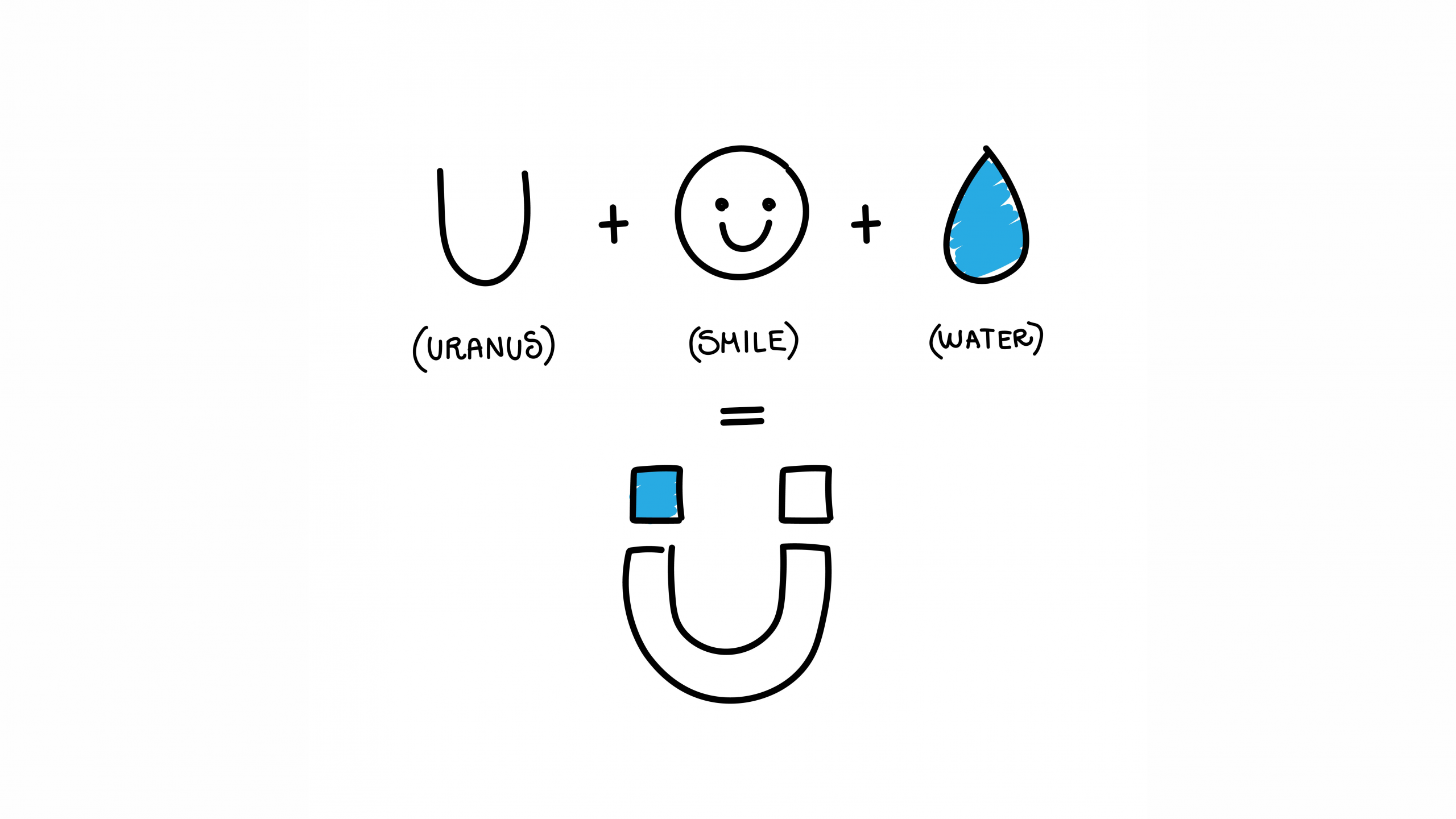
The concept combines three elements: the U from Uranus, the shape of a smile, and a drop of water. Together, they form a distinctive monogram that feels friendly, recognisable and directly connected to the product.
The identity was then developed across the bottle range, packaging and digital applications, creating a flexible system that could work consistently across different colours and formats.