
Rays Chicken – Brand Identity
Rays Chicken is a Copenhagen-based fried chicken brand with a bold, informal personality. The project focused on building a stronger and more consistent visual identity across packaging, print, digital and in-store communication.
The starting point was simple: how could we make the brand more memorable? Working closely with the owners, I developed a playful and distinctive visual direction that could grow with the business while staying flexible across different formats and touchpoints.
CLIENT
RAYS CHICKEN
SERVICES
Brand Identity, Art Direction, Packaging, Print & Digital Design
CREDITS
Ornella Gianforte – Brand Identity, Art Direction & Animation
Andrea Bayer – Photography
YEAR
2025-2026
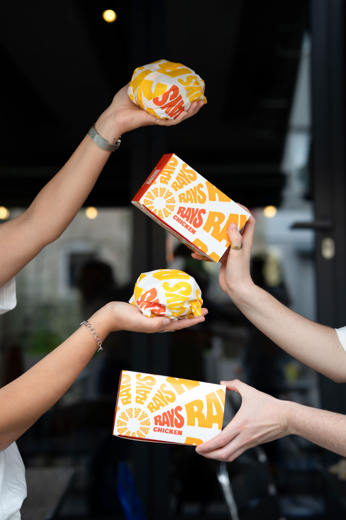

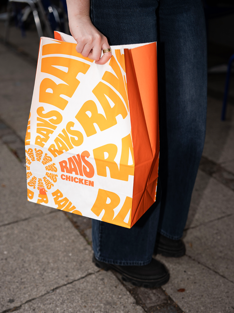

The concept came directly from the name: RAYS.
The identity is built around graphic rays that expand, frame and highlight content across different formats. Combined with bold typography, strong contrasts and playful compositions, they became a simple but recognizable visual device for the brand.
Rather than creating a fixed set of layouts, I developed a flexible system that could adapt to menus, packaging, signage, social media and other everyday communication while keeping the brand consistent.
From identity to everyday touchpoints.
The visual language was gradually extended across the restaurant experience, from packaging and printed material to digital content and in-store communication. Working directly with the owners made it possible to test, adapt and develop the system as the brand evolved.
The result is a visual identity that feels bold, approachable and easy to recognize, while remaining flexible enough to grow with the business.
Keep an eye out for the little chicken.
You’ll find it popping up here and there across the identity, often where you least expect it.


